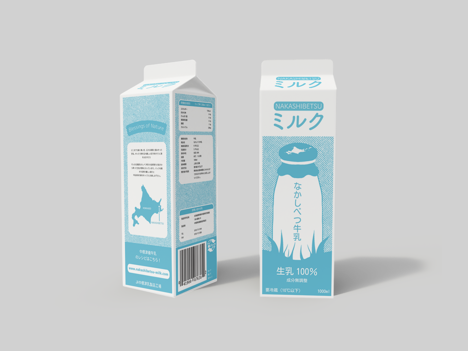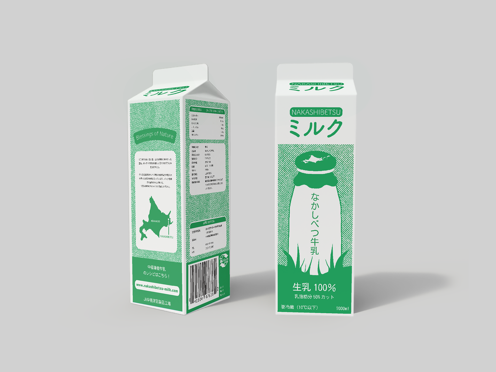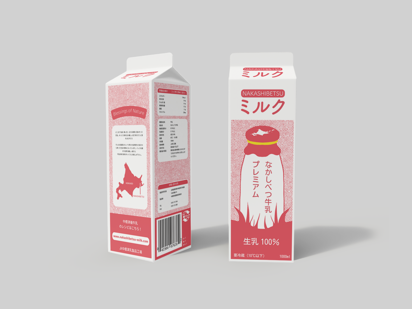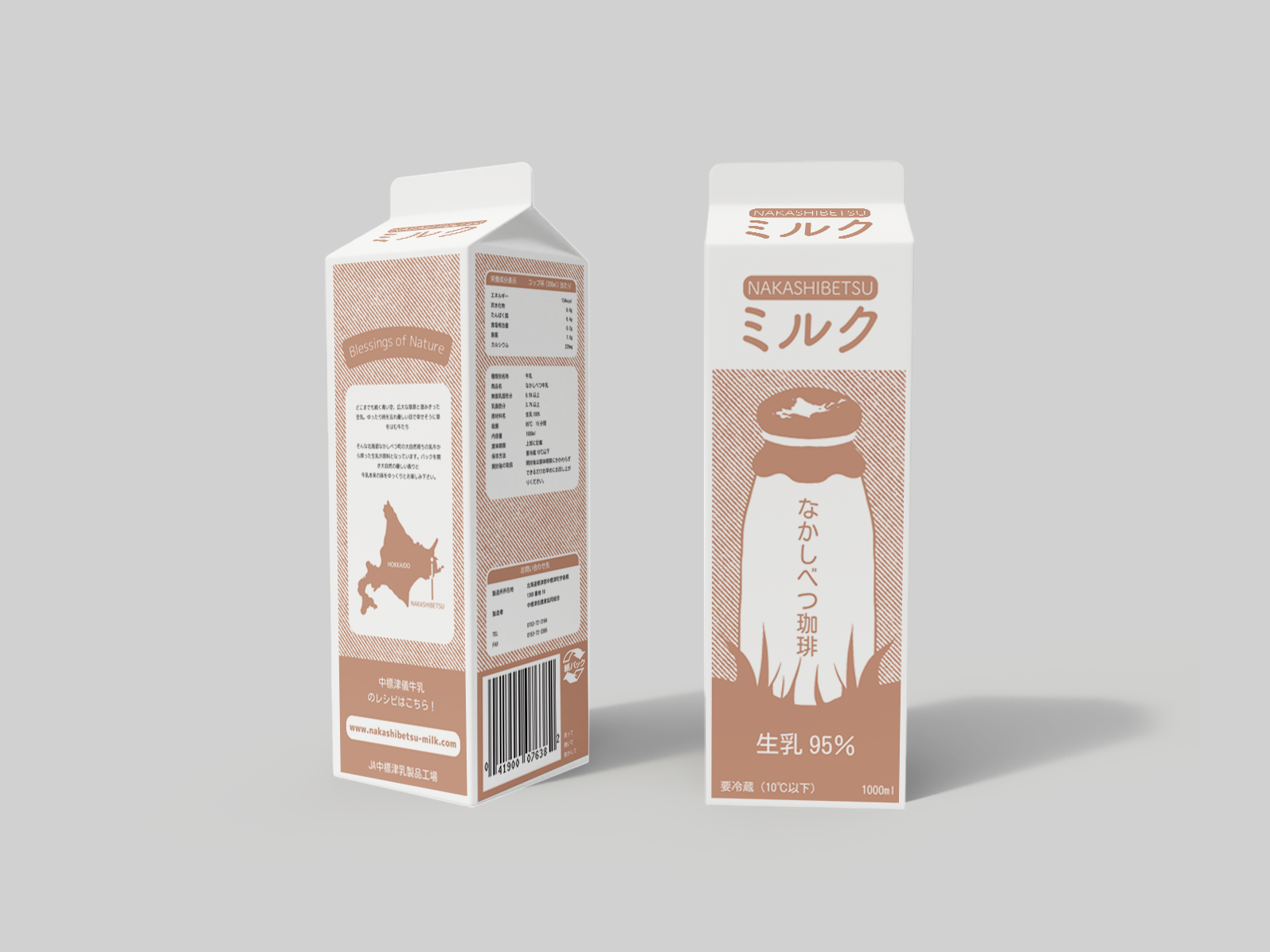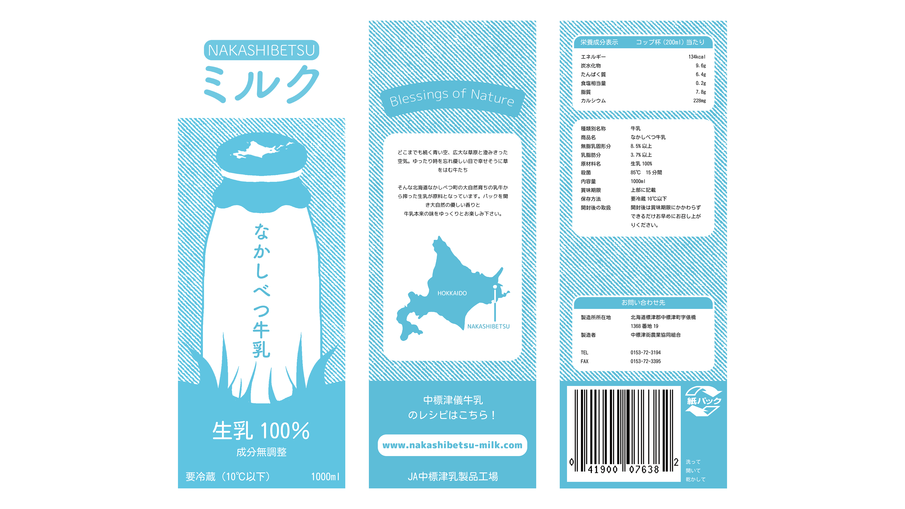
During my internship in Hokkaido, Japan, I was given a brief of redesigngng the town of Nakashibetsu's Milk's packaging. . I wanted to create a modern but still friendly design that could be easily altered to represent their other types of milk: low fat, premium and coffee.
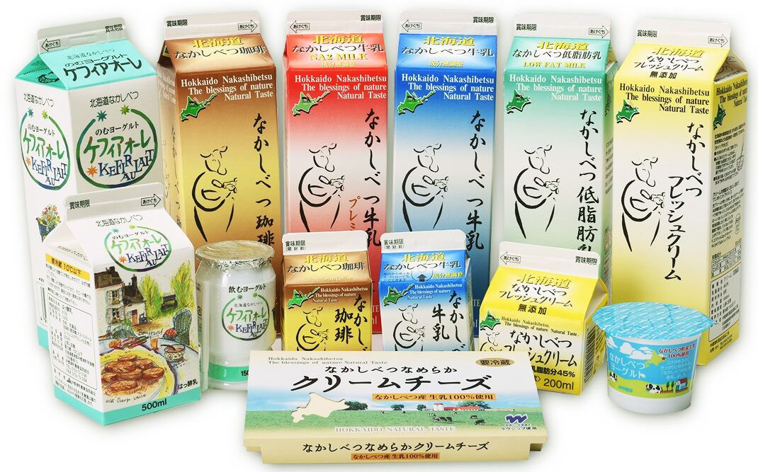
This is Nakashibetsu Milk's current branding. I felt like there was a lot of text and lack of cohesiveness with the illustrations. My colleagues felt that it was important to include the island of Hokkaido (where Nakashibetsu is) within my illustration. As this is quite a complex shape, I wanted the main piece to be very simple.
The milk glass illustration gave breathing room for text, whilst also giving the milk a 'natural' and 'local' feel. The packaging is in two colours - allowing for easy alteration when designing the other milk variations.
The milk glass illustration gave breathing room for text, whilst also giving the milk a 'natural' and 'local' feel. The packaging is in two colours - allowing for easy alteration when designing the other milk variations.