I found this book to be a really interesting read, and made me change my way about thinking and my understanding of gender, and womanhood.
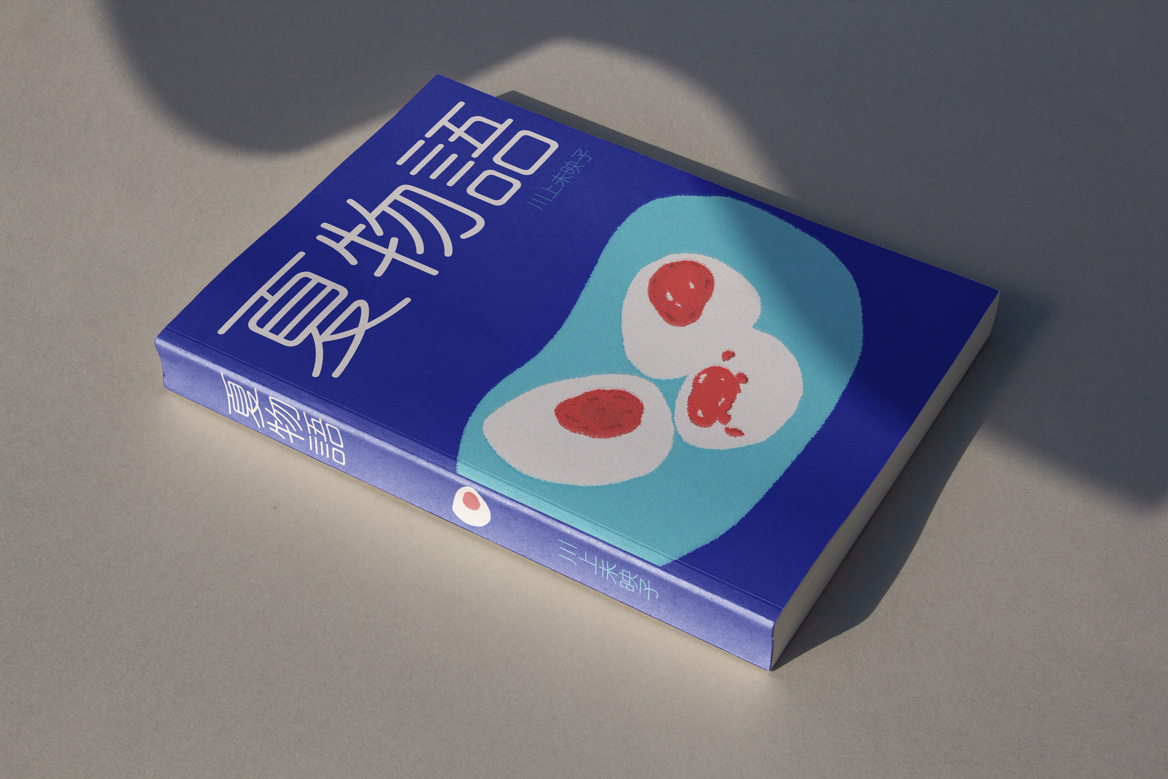
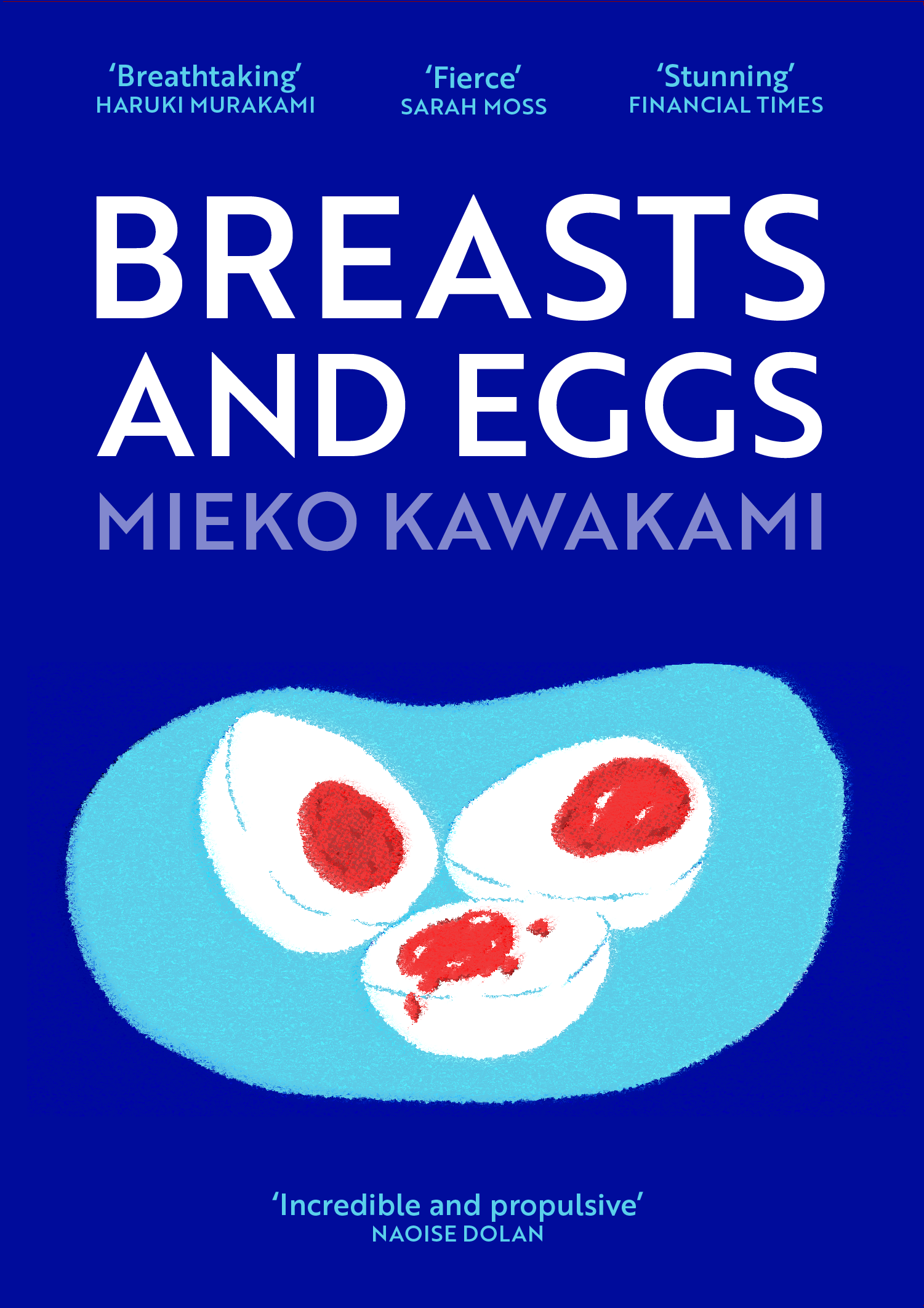
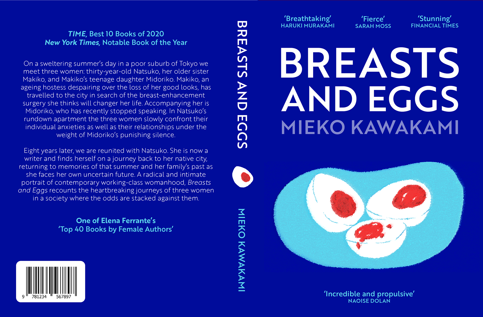
EGGS
The book follows three women who are at different stages in their life. One is 12, one is 30 and one is 40. I represented this within the eggs; each one is boiled for different lengths of time.
Menstruation, fertility and mother hood are recurring themes in the book. I chose to make the yolks red to represent this, and felt the yolks represented 'fertility' in relation to each woman. Eggs also have a likeness to breasts when drawn this way.
I chose blue as it contrasted the red well, and to show the pressures of gender expectations within Japanese society surrounding them.
I also opted for a bold font as I felt this made the book feel more modern and approachable.
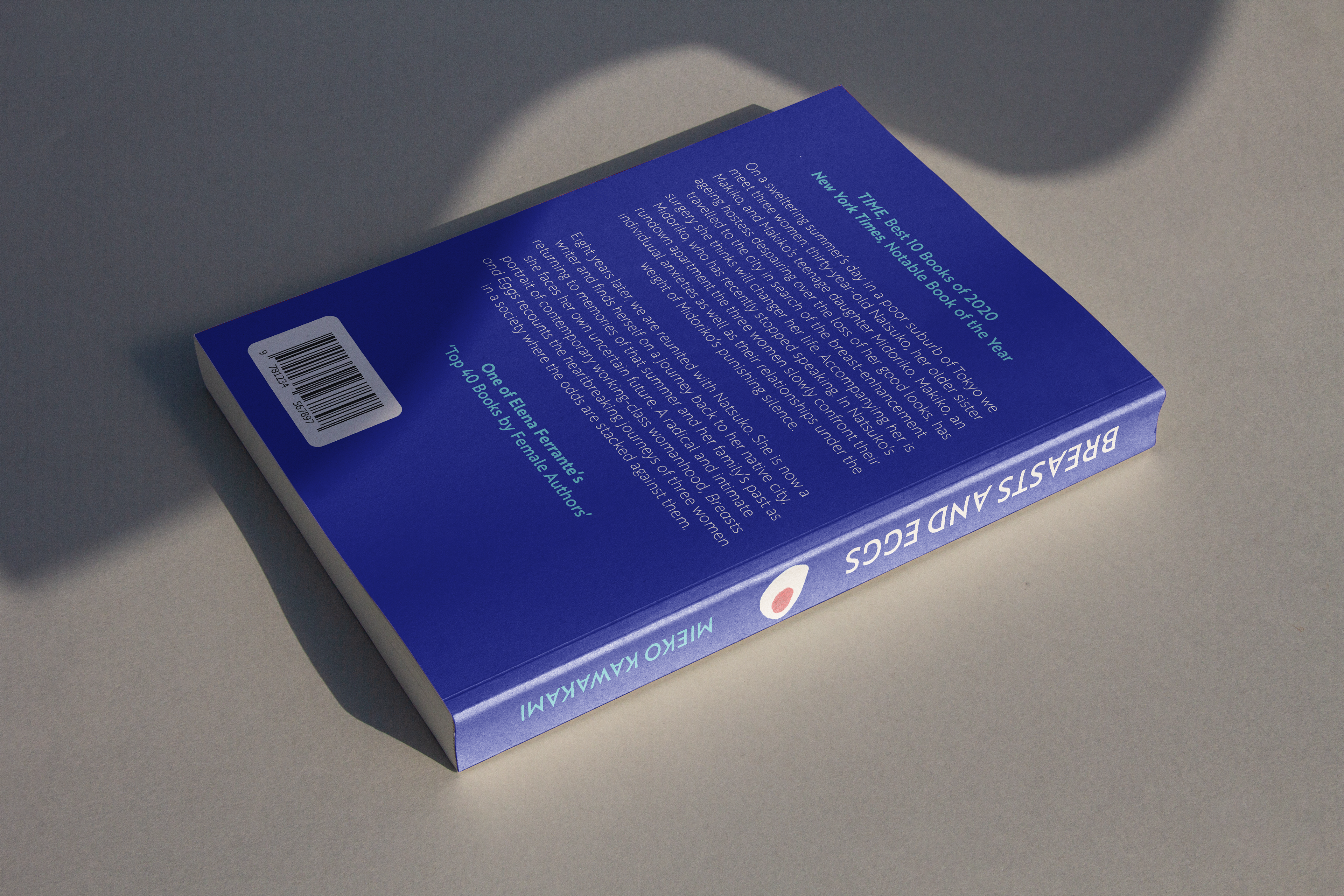
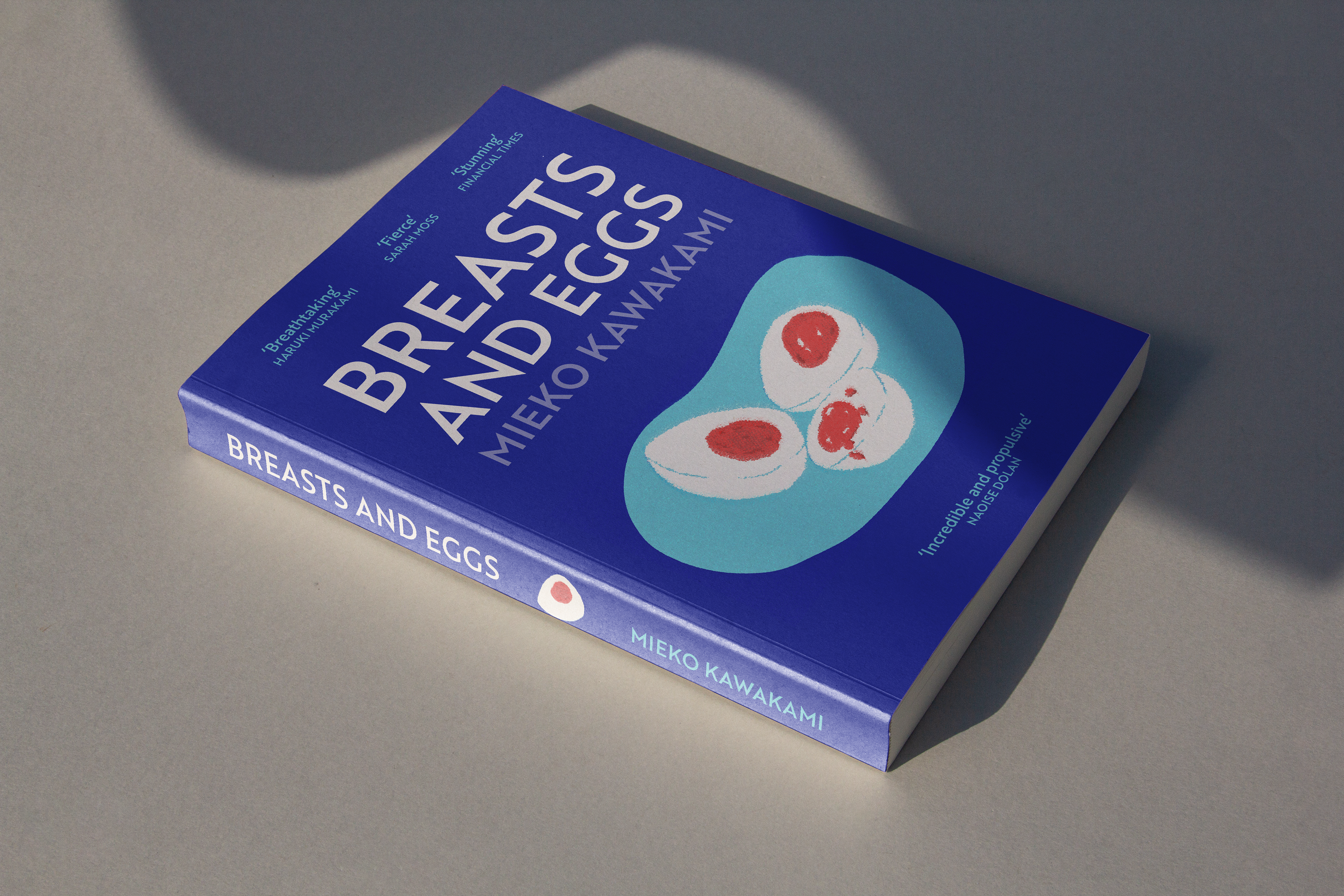
Final book cover in a mockup.

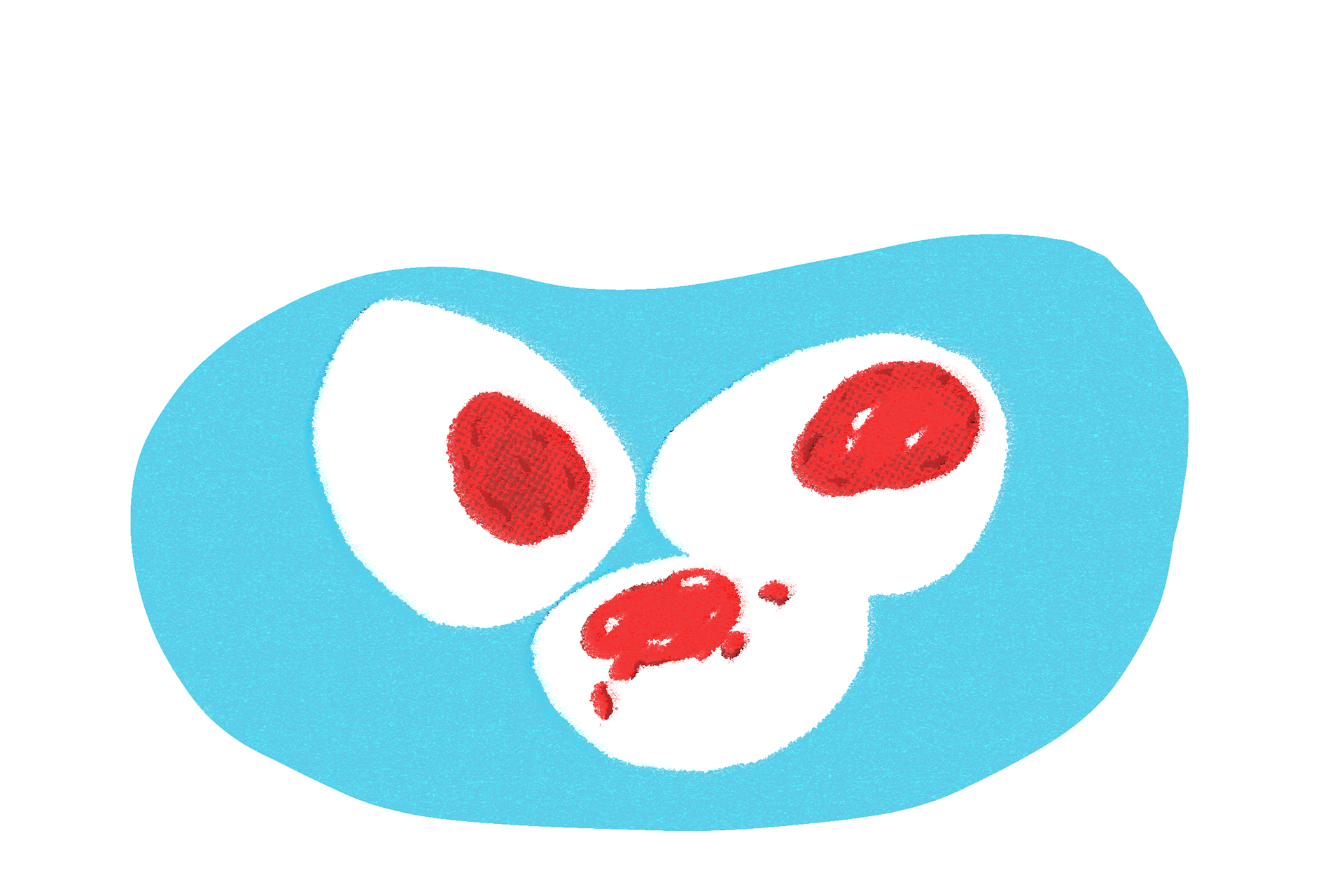
These were two other options. Option one was pretty alone but made the cover look too busy. Option two had too little information and looked a little too abstract. The lines in the final version contained enough information and worked better with the typography as a whole.